The turn of the month effect of stock indices is a well documented and commonly known phenomenon. A 2015 published paper and the related WSJ article explain that institutional investors require cash at the end of the month and thus sell assets, driving down the prices. At the beginning of the next month, the beneficiaries receive their cash and reinvest part of it to mutual funds, who in turn buy the assets sold on the markets roughly a week ago, driving up the prices. To profit from this phenomenon, one buys the index four days before the month’s end and sells it on the third day of the following month.
To validate this effect we first download the daily closing prices of OMXH PI covering years 2005-2015. We then prepare the data for analysis and begin to implement the strategy.
First, we fix the holding period to seven days to conform with the setups used in the earlier studies and calculate the profit of all trades that cover the turn of the month. We find that indeed the approach generates profits. Surprisingly by far the best result was attained by selling on the very first trading day instead of the third. This way the annual profit was around 8.2 %, topping the benchmark index by 2.75 %-points!
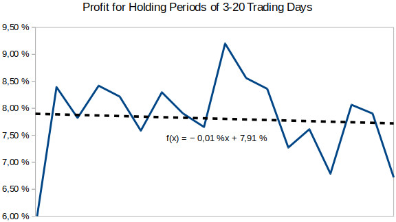
This of course arouses suspicion of the seven day holding period – if the third day was not observed to be the optimal time to sell, why should the seven day holding period be optimal? Indeed we find it’s not, as shown in the first figure.

It seems that the length of the period does not really matter – all of them are able to beat the benchmark index. The best annual profit of 9.2 % is achieved with a holding period of 12 days. However, these results make one wonder, why would it be possible to get equally good profits with a holding period of 18 days (a month has some 21 trading days) as with 8 days?
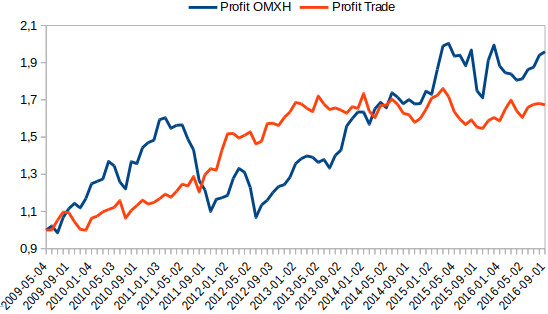
As stated earlier, compounding the profits from trades that last e.g. seven trading days ending on the first of the following month during the entire backtesting period, we find the strategy to beat the index by approx. 2,75 %-points annually. However, the performance deteriorates significantly after the 2008 crash.

The next figure illustrates the profits of the OMXH index and the turn of the month strategy starting from May 2009. The strategy’s performance is not very good. During 2009-2015 the index had annual profit in excess of 11 % while the strategy had less than 8 % (ignoring spread and expenses).
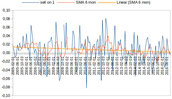
The deterioration is confirmed by examining how the profitability of the individual trades has evolved over time as shown in the final figure. The strategy was the same as before and the blue line shows the profits of the individual trades. A few outliers from 2008-2009 were removed to make the figure better represent the “typical market conditions” of the period.

The trade profits are smoothed with a six month moving average and a regression line is fitted to the data. We observe the rate of return has been in the decline for a decade now and probably will continue to doing so until the strategy is rendered fully unprofitable. This phenomenon is observed in the DAX index as well.
The takeaway from this exercise is that averaging can hide changes in the market dynamics: something that worked ten years ago might not work anymore. Thus it is utterly important to study how the performance has changed with time.
The implication of this is that more data is not always better. When developing methods that should work well in the future, they should be based on data that accurately represent the future observations. This is easier said than done.
Alkuperäinen kirjoitus on julkaistu LinkedIn-palvelussa.